BHCI'2016 - Conference Article Appendix
Paper
Assessing User Interface Aesthetics based on the Inter-subjectivity of Judgment
Mathieu Zen and Jean Vanderdonckt
Abstract - "How to assess user interface aesthetics?" remains a question faced by many user interface researchers and designers during the user interface development life cycle since aesthetics positively influence usability, user experience, pleasureability, and trust. Visual techniques borrowed from visual design suggest that the graphical user interface layout could be assessed by aesthetic metrics such as balance, symmetry, proportion, regularity, and simplicity, to name a few. Whereas different formulas exist for computing each aesthetic metric and different interpretations to sum up their results, no consensus exists today on how to consistently evaluate these metrics in a way that is aligned with human judgement, which is intrinsically subjective. In order to address the challenging alignment of human subjectivity with machine objectivity, this paper reports on an experiment comparing the results issued from the inter-subjectivity of judgment of fifteen participants evaluating four main aesthetic metrics on a sample of ten graphical user interfaces and the values of these metrics calculated semi-automatically by a web-based application. The experiment suggests that some metrics, e.g., symmetry, proportion, simplicity, as computed from the formula are actually positively correlated with human judgment, while some other metrics, such as balance, are surprisingly not correlated with the formula computed, thus indicating that another formula or another interpretation should be determined. Therefore, a new formula for computing balance is defined that decomposes balance into horizontal and vertical balances which re-establish a correlation. This paper then provides some new insights on how to rely on these aesthetic metrics and other related metrics, whether they are interpreted manually or computed automatically.
Experiment
In order to give credit to the automatic computing of aesthetic metrics by a software, the aesthetic metrics, as they are computed, need to be aligned with the human judgement. This section reports on the results of an experiment conducted towards this goal.
We chose to conduct an experiment with a comparison method. This approach benefits from several potential advantages over previously conducted methods: participants do not need to remember the scores they previously assigned to other UIs, thus avoiding inconsistent and conflicting results; the method simplifies the evaluation process dramatically by avoiding to ask each participant to evaluate each aesthetic metric for each UI considered in the data set. Instead of giving a score for one metric on a 5-point Likert scale or quantitatively for one UI at a time, the participants were instructed to pick from a pair of 2 candidate UIs which one was representing the best the aesthetic metric, i.e. that would have obtained a higher score for the measure
Participants were recruited from a mailing list maintained at Université catholique de Louvain. No compensation was offered to volunteers. The experiment took place in a controlled environment where respondents (N=15) replied to an electronic survey in the presence of interviewers. Before starting the experiment, the participants were asked to provide some personal information for statistics: age, gender, background, prior experience with aesthetics, prior experience with UI evaluation.
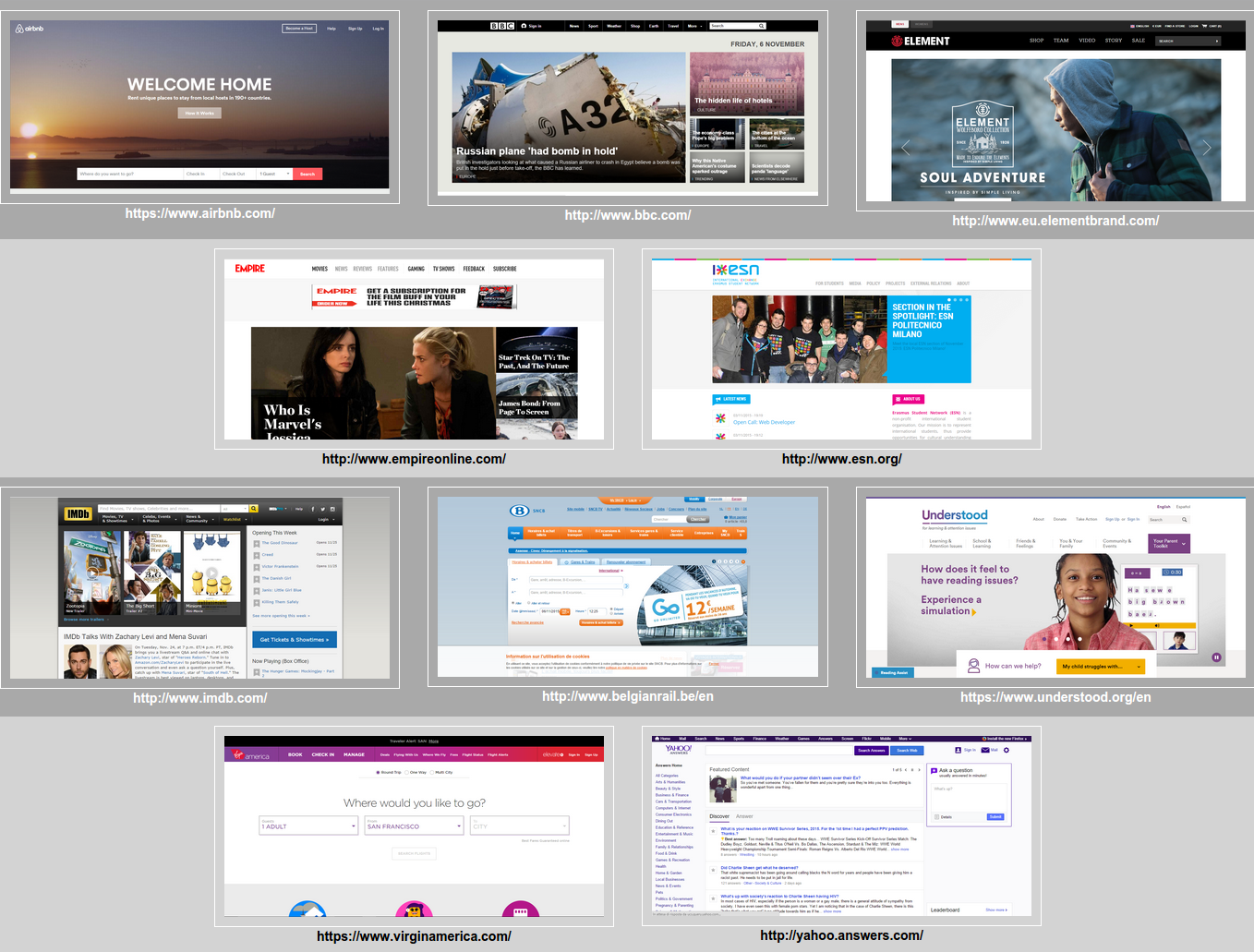
Ten different web sites were selected first for their general interest (thus subsuming the fact that no semantic knowledge of the domain is required) and frequency of use, then divided into four categories (i.e., news, on-line shop, education, and booking). These UIs have been selected based on Nielsen and Molich (1990) heuristics about aesthetics and minimalistic design: there are both ”beautiful” web sites and ”ugly” web sites, where ugly stands for non-compliant with the aesthetic metrics and Nielsen heuristics. In particular, we hypothesized that the web sites are ranked according to their aesthetics score as follows:
- Low: SNCB (railways web site), Yahoo Answers, IMDB cinematographic web site
- Medium: Erasmus Student Network, Understood, Empire
- High: Air B&B, Element, Virgin America, BBC News
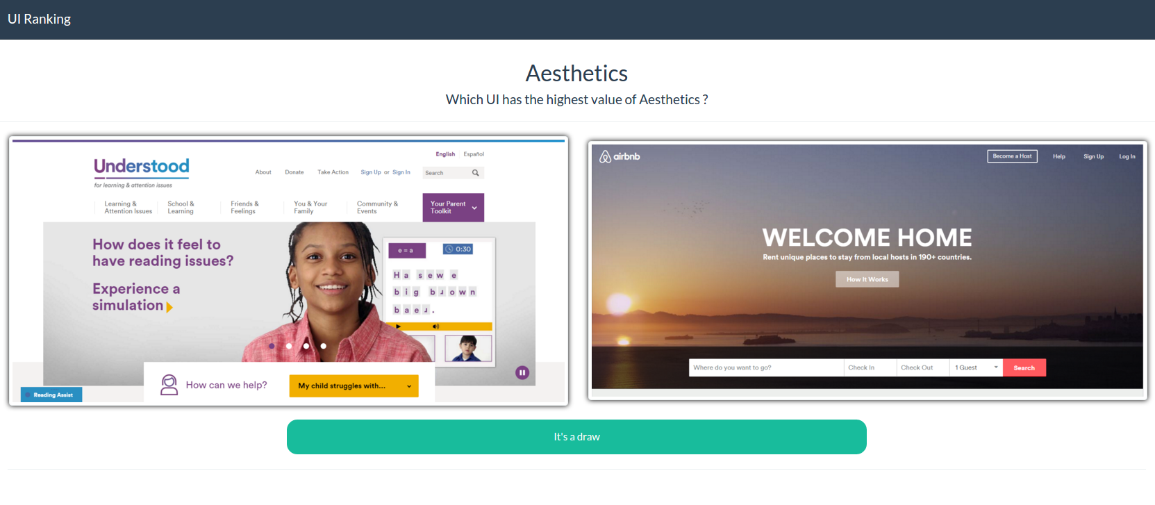
We developed and installed an A/B testing survey application (Figure 2b) where two UI screenshots were randomly selected from the pool and were presented to the user so as to select by clicking on it which one is representing positively the most the considered aesthetic metric, i.e. the user has to select the one that she thinks to have the higher value for the metric. For every positive selection, one point is given to the global score of the UI. If the participant is undecided, he has the possibility to click on the “draw” button, no point is assigned and two new UIs are further presented. In order to prevent responses biases, the UIs are also displayed in a random order and each pair of UI is verified as being unique to avoid any duplicate. The comparisons are done for each of the four aesthetic metrics. Before each suite of pair comparisons, a textual description with illustration of the aesthetic metric is delivered.
In a nutshell, the survey requested the respondents to compare the 10 selected UIs 2 by 2 in the light of 4 selected aesthetic metrics. For each metric, forty-five unique comparisons were generated, which could be achieved in more or less five minutes, that is a total of 20 minutes per participant. No time constraint were imposed to participants
The whole experiment application material has been released on github in order to be reproduced if needed.
View on GitHubData
The container below render a collapsible presentation of the data collected through the experiment. It consists of two main objects:
- Data - the view of the data collected classified by each visual technique
- Users - the view of the data collected classified by each user
How to navigate ?
You can either explore the data by visual technique.
Ex: the path data>Aesthetics>airbnb>comparisons>bbc enables you to consult the array of users responses corresponding to the comparison of the AIRBNB website with the BBC website according to their aesthetics. 3 possible values:
- 1 means AIRBNB is preferred by the user to BBC
- -1 means BBC is preferred by the user to AIRBNB
- 0 means the user has no preference for both webpages
Another possible path to consult the data is by user
Ex: the path users>1>Aesthetics>airbnb>comparisons enables you to consult the array of user1's responses corresponding to the comparison of the AIRBNB website with all the other pages.
Download as
JSONMade with json-formatter-js
Questim
For computing the aesthetic metrics of this experiment, we developed and used QUESTIM (Quality Estimator using Metrics), a Web-based evaluator software enabling semi-automatic computation of the aesthetic metrics as described. QUESTIM is threefold: (i) a web service written in Java and then compiled into JavaScript with Google Web Toolkit (GWT) providing so-called \emph{Aesthetic Evaluation as-a-Service} (AestaaS), which could therefore be reused by another application for the same purpose; (ii) an on-line application based on this web service freely accessible at http://questimapp.appspot.com with which it is possible to copy/paste any URL of a web page to be analysed - therefore, no need to redraw anything; and (iii) an API providing the possibility to post a structured description of the positions and dimensions of layout's regions of interests and immediately receive a JSON response with the computed metrics, which is particular useful for assessing the aesthetics of any graphical user interface (not just web pages), any sketched user interfaces (e.g. produced with wireframe tools such as www.balsamiq.com), hand-drawn user interfaces and other types of UI prototypes (e.g. pictures, excerpts from a video) as opposed to real screen shots.
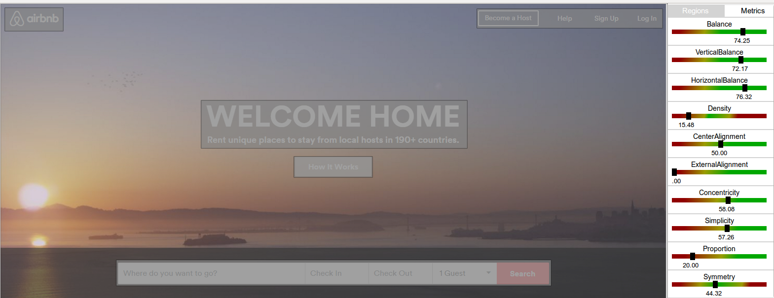
The four aesthetic metrics selected for the experiment were:
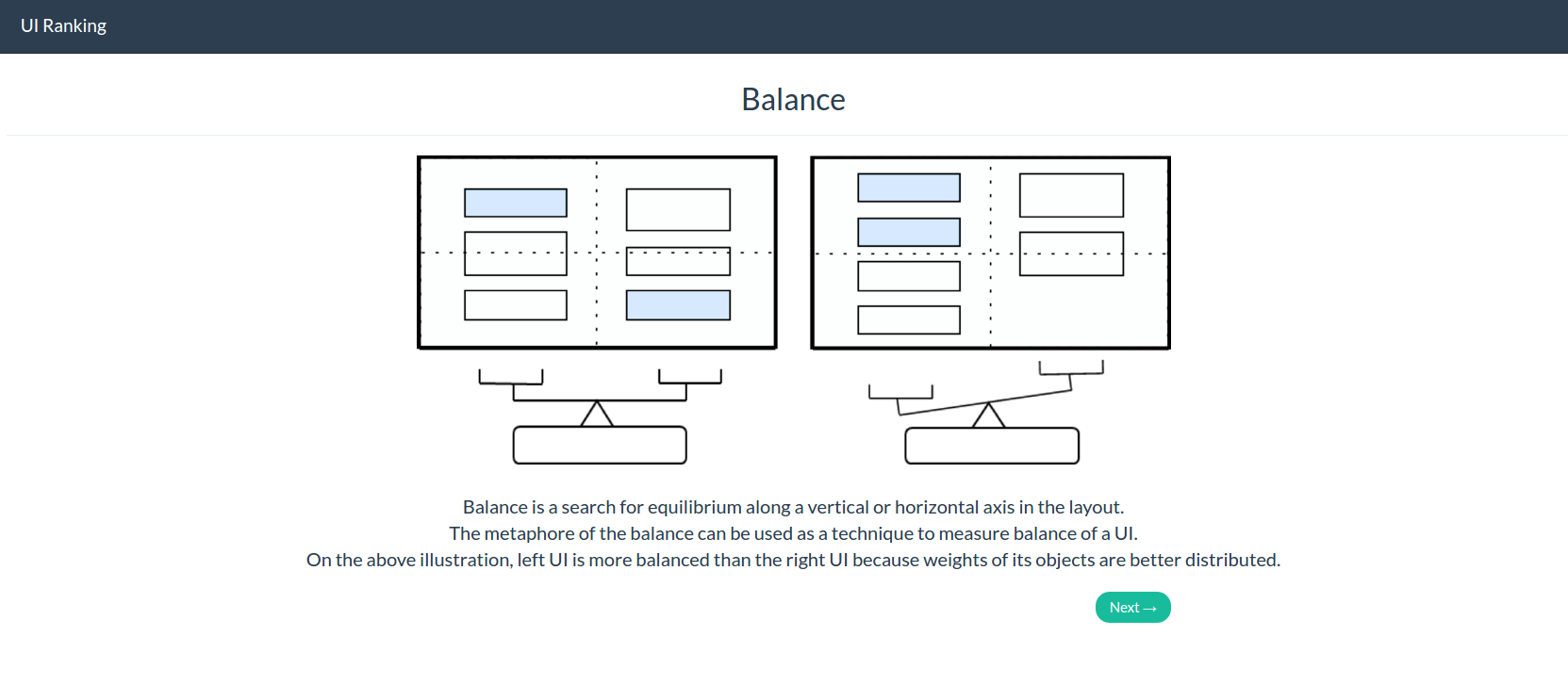
- Balance
- Proportion
- Simplicity
- Symmetry
Questim Data
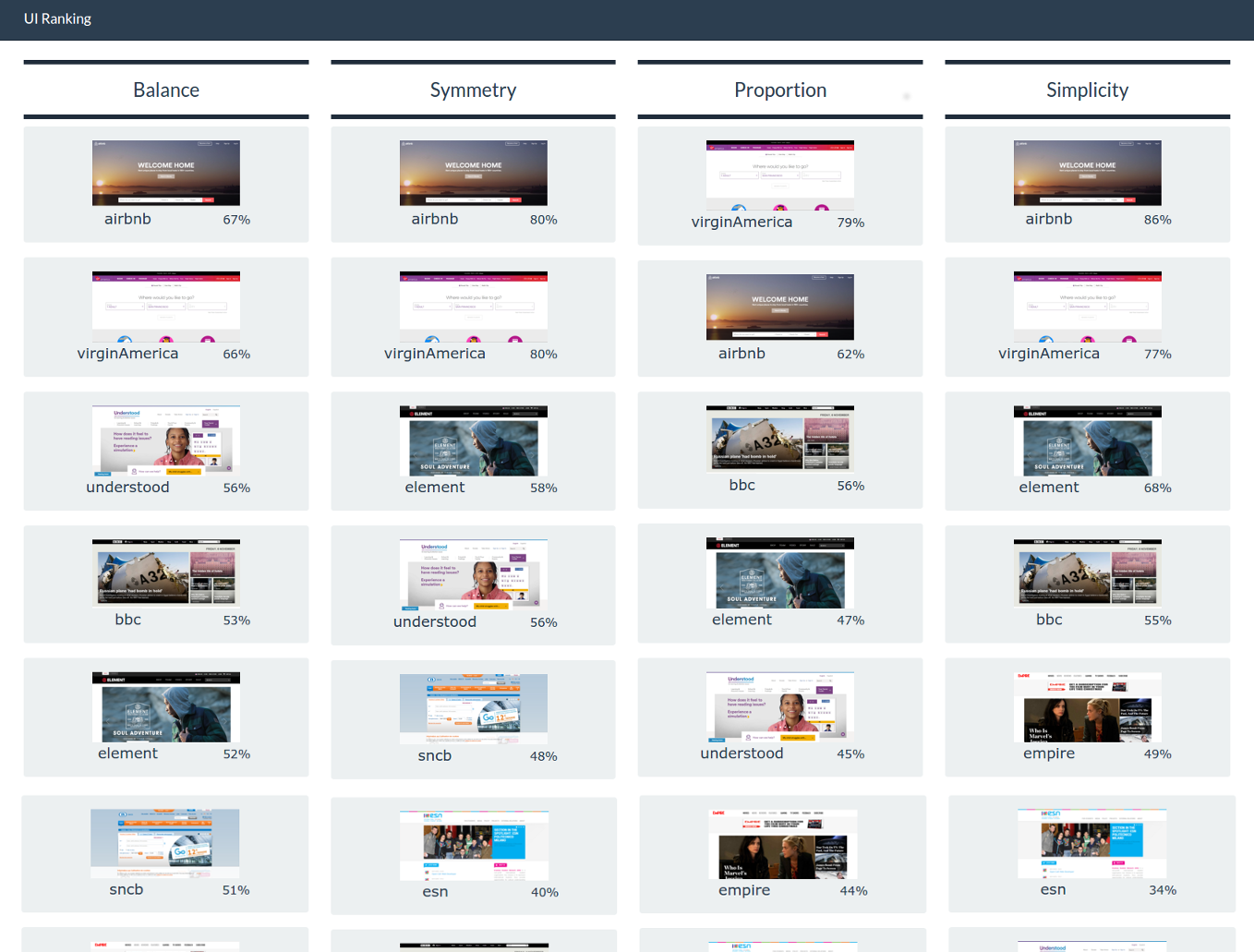
The tables below present the metrics values for each UI (scores between 0 and 100) and a UI ranking obtained with those values (QUESTIM) compared to the results collected during experiment (HUMANS) for each considered metric.
Data Analysis
This section uses HTML imports functionality (see if your browser supports it - works with Chrome and Opera)
We first analyzed the data gathered exclusively about the global aesthetics of the pages. The participants were asked to judge only how pleasant were the screens for them. Using the same methodology discussed supra, namely a paired comparison model, participants were asked to choose between UIs which one they found the most visually pleasant. Therefore, we were able to draw a symmetric matrix of results associating for each pair of UIA and UIB a score between +15 and -15 (15 being the number of participants) where a score of +15 would mean that UIA is preferred to UIB by all respondents in terms of aesthetics. Whereas a score of -15 would mean that UIB is preferred to UIA.
After normalizing the values, a new table is obtained with scores between -1 and +1. This normalised table for the value of aesthetics would not be useful as the tool does not give a global value of aesthetics but rather a specific value for its visual components, namely for the aesthetic metrics. The scores for the metrics of balance, simplicity, proportion and symmetry are presented with the same method and compared to the results obtained with the tool.
In order to compare the humans reviews with the scores computed by QUESTIM, we had first to find a common ground for analysis, i.e. a similar data structure. Hence, we used the software considered as a new participant and made it pass the same experiment than the one done by the human participants. We used the difference between the scores given for the metric for each UI as a magnitude scale and normalised it in order to obtain values in a range between -1 and 1, and not exactly -1 or 1. A new table reproduces the score given by the software for the metric of simplicity for each pair of UIs.
For the sake of clarity and to provide another view of the matrix correlations (comparing participants values and software values), we chose to present this table with heat maps where each cell follows this coding scheme:
- If the sign of a paired comparison value given by QUESTIM is equal to the sign of the same value given by the participants for the same pair, e.g. positive and positive - or - negative and negative, the cell will be colored in green. Otherwise, it will be colored in red.
- The intensity of the cell color is determined by the proximity of the compared values, e.g. if the sign is the same and the absolute values are really close, the cell will be tinted in green with more saturation, while keeping the same hue.
About the authors

Mathieu Zen holds a master degree in Business Engineering from Louvain School of Management (LSM) at Université catholique de Louvain (UCL, Belgium) where he is now a Research and Teaching Assistant. He is a member of the Louvain Interaction Lab (LILab) where his doctoral research in Human-Computer Interaction (HCI) is focused on investigating user interfaces aesthetics measurement and evaluation. In 2014, he took part in the QualIHM project - a collective research funded by the Walloon region - which goal was to provide a requirement engineering toolkit for efficient user interface design. His teaching functions at university are related to courses in algorithmic, programming and modeling. In his free time, Mathieu enjoys learning new technologies, developing mobile apps (LLN Maps), spending time with family and playing football with friends and colleagues.

Jean Vanderdonckt is Full Professor of Computer Science at Université catholique de Louvain (UCL, Belgium) where he is Head of the Louvain Interaction Laboratory (LiLab). He holds a master and an aggregation in mathematics, a master in computer science and a PhD in Sciences from University of Namur. He has been Visiting Associate Professor at Stanford University (2000), invited professor at Univ. of Fortaleza (2001), and invited prof. at Polytechnic Univ. of Valencia. He has over 25 years of experience in research and development in Human‐Computer Interaction. He is currently ACM and IEEE Senior Member, and member of ACM SIGCHI. He received several awards (e.g., the IBM Belgium Award in Computer Science in 1998, the ACM Service Award for Contributions to ACM in 2004, 2006, and 2010, the Brian Shackel Award in HCI in 2007, the ITEA Research Excellence Award in 2013) and fellowships (e.g., Fulbright‐Hayes fellowship in 2000, NATO Advanced Fellowship in 2001). He is currently co‐editor‐in‐chief of Springer Series in Human‐Computer Interaction.