OBSERVATION AND HEURISTIC EVALUATION
Squint Test

Most Important Thing should catch your eye first
Scientific reasoning
Magnocellular neurons <> Parvocellular neurons
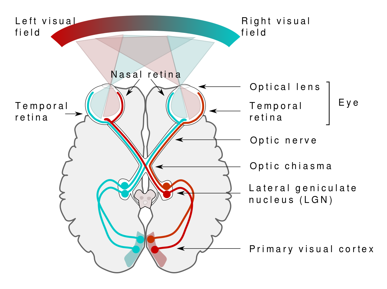
Both parts of the Lateral Geniculate Nucleus of the thalamus
- M-Cells: sensitive to gross shape, luminance, and motion
- P-Cells: sensitive to color and detailed shape
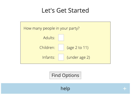

Redesign

Heuristic Evaluation

Photo by Raul Varzar
Heuristic = practical method to find a sufficient non-optimal solution in a reasonable amount of time
(from Greek εὑρίσκω meaning "I find out")
Nielsen’s usability heuristics
- Visibility of system status
- Match between system and the real world
- User control and freedom
- Consistency and standards
- Error prevention
- Recognition rather than recall
- Flexibility and efficiency of use
- Aesthetic and minimalist design
- Help users recognize, diagnose, and recover from errors
- Help and documentation
keep users informed through appropriate feedback
speak the users'language with real-world terms
provide an "emergency exit", support undo and redo
keep your system familiar to the user
eliminate error-prone conditions or mitigate risks
minimize user's memory load by making options visible
allow users to tailor frequent actions
extra unit of information should be relevant and justified
error messages should be clear and suggest a solution
provide documentation but do not rely on it only
Visibility of system status
keep users informed through appropriate feedback

The Legend of Zelda: Breath of the Wild provided consistent and nearly immediate feedback for player’s health status via the 3 heart icons displayed in the top left corner of the screen.
Match between
system and the real world
speak the users'language with real-world terms

PlayerUnknown’s Battleground used real-world weapon terminology for in-game weapons.
User control and freedom
provide an "emergency exit", support undo and redo
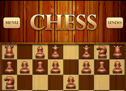
The Chess iOS game gave users the control and freedom to undo their last move.
Consistency and standards
keep your system familiar to the user
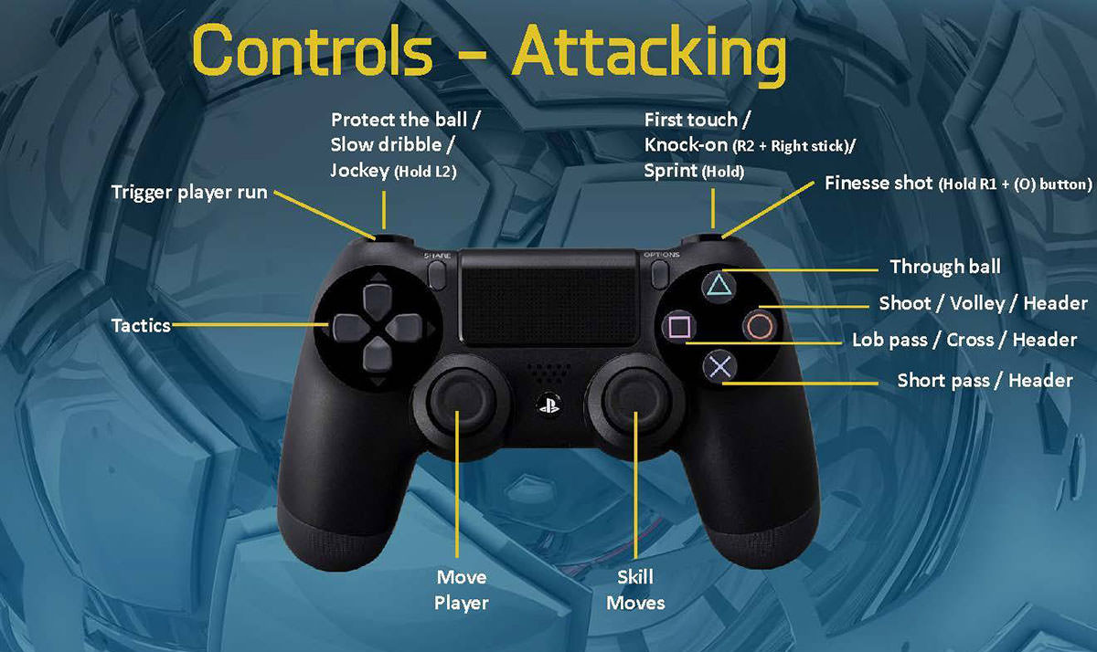
FIFA players used to play the game with "circle" for shoot and "square" for lob pass while PES players usually prefer the opposite controls.
Error prevention
eliminate error-prone conditions or mitigate risks
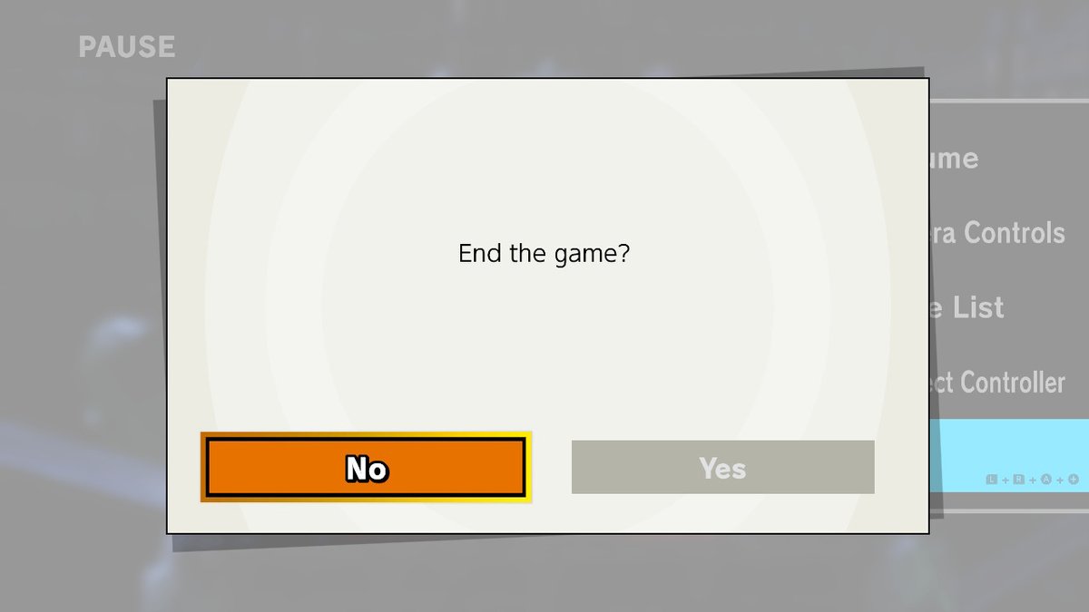
Super Smash Bros on Nintendo Switch provided a confirmation dialog before users quit a game.
Recognition rather than recall
minimize user's memory load by making options visible

Contextual game controls are displayed directly on the screen in Red Dead Redemption 2 so that users don’t have to recall controls from memory.
Flexibility and efficiency of use
allow users to tailor frequent actions
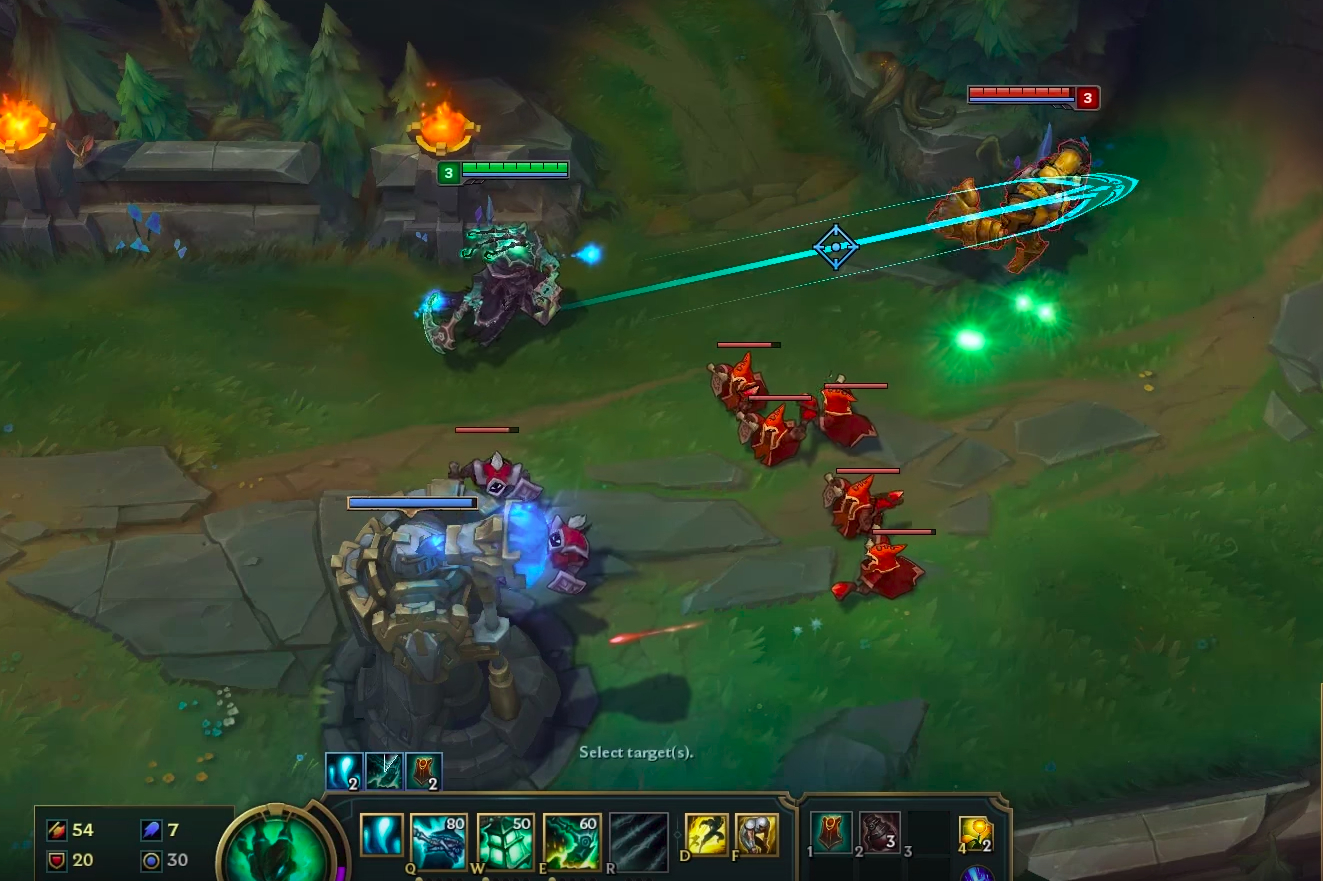
League of Legends provide a smart cast feature enabling the user to have a visual indicator when casting a spell. Expert users can disable it in order to press one less key and cast faster.
Aesthetic and minimalist design
extra unit of information should be relevant and justified

The Journey is an indie adventure game very different from usual games. The information provided to the user is minimalist and foster exploration.
Help users recognize, diagnose, and recover from errors
error messages should be clear and suggest a solution

World of Warcraft inform the user how to connect when an error has been commited while logging in the game.
Help and documentation
provide documentation but do not rely on it only
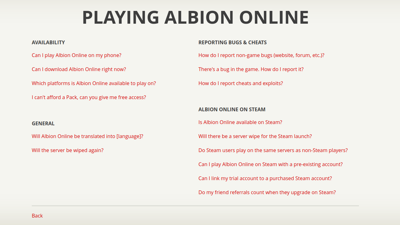
Albion Online, like many other MMORPGs, provide clear and well organized documentation for players
Usability Checklist
teamsucces.io/UX
additional information to help you spot common usability problems in your design
Number of Evaluators
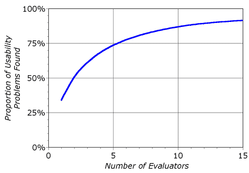 $ProblemsFound(i) = N(1-(1-l)^i)$
- $i$ is the number of independent evaluators;
- $N$ is he total number of usability problems;
- $l$ is the % usability problems found by a single evaluator (μ=34%);
Nielsen and Landauer (1993)
Further reading
- 4 rules for intuitive UX by Erik D. Kennedy
- How to Conduct Heuristic Evaluation by Hsin-Jou Lin
- 10 Usability Heuristics Applied to Video Games by Alita Joyce
- 10 Usability Heuristics with Examples by SaiChandan Duggirala